



What is a design system?

What exactly is a design system?
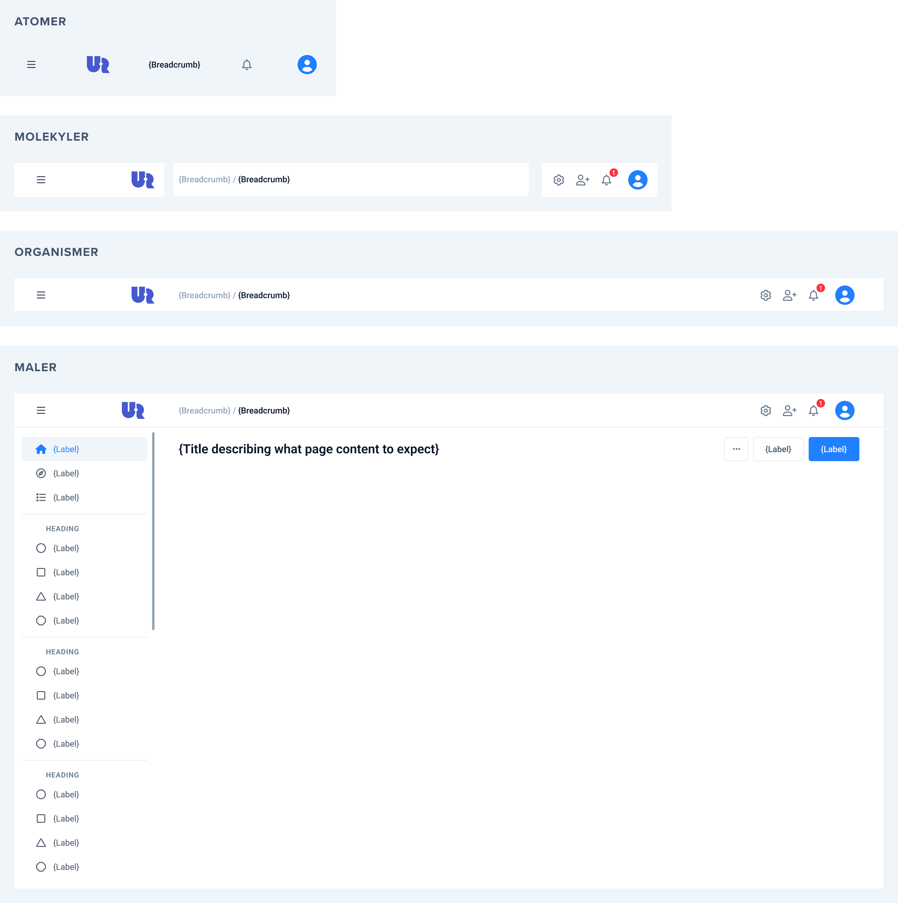
With the book "Atomic Design" from 2016, Brad Frost defined a way of thinking that breaks up user interfaces into building blocks: In the same way that several atoms create a molecule and several molecules create an organism, we can break down a user interface into small pieces, which together make up the user interface:
1. Foundations
Typically includes guidance on accessibility, colours, typography, spacing, shadows and more.
2. Design tokens
A "Design token" is a description of a style value and consists of three elements: A name, a value and a type.
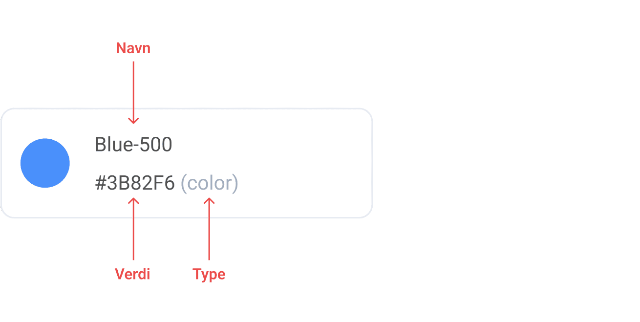
In the example of a color, the name at a basic level can often just contain the absolute name of the color, and a number that defines the shading (as shown in the example above), but it suddenly becomes more powerful when the name defines how the color will be used. We can also build systems with design tokens in several layers, which allows us to create "headless" design systems: We can follow some basic rules, but have the opportunity to visualize different brands and themes within these frameworks.
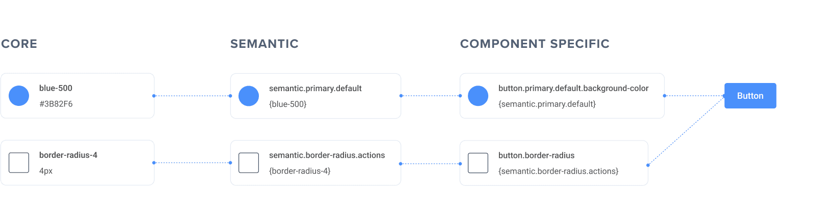
One of the main points of using design tokens is that we create a common understanding of how things should be: Designers and developers speak the same language to a greater extent, which reduces misunderstandings and helps create a "single source of truth".
3. Components
Components are an important part of a design system, and this was largely what Brad Frost referred to with "Atomic design", where we can break up user interfaces into a hierarchy of components. That doesn't mean it's necessarily right for your team to create a complex jumble of nested components, but in many cases it's useful to organize a library of basic lower-level building blocks (such as buttons, text fields, and icons) and more complex, composite, higher-level components (such as navigation menus, forms, and cards).
How do you know if you need a design system?
If your product lacks consistency and you carry out iterative design and development tasks that are time-consuming, this is a clear indicator that a design system may be needed. Another sign could be if your company expands with more products or platforms that need to maintain the same visual identity. More generally, if you see a need for greater collaboration and a shared understanding of design decisions, a design system can help improve communication.
How to get started with a design system
In general, I am a fan of documenting the work I do, but the documentation does not always need to be extensive. In some cases, an "overdesigned" system can make you work less efficiently. If you are in the early stages of developing a digital product, it may be wise to start simply and set up a system that can grow alongside the product and the company. A good place to start is to talk to your team. Useful questions include:
- Do we have documentation that everyone working on the product understands and uses?
- How can we evaluate and adjust our approach to documentation over time to ensure it is relevant and useful?
- Do we have something that is under-documented?
- Do we have something that is over-documented?
- How can we facilitate open communication and collaboration when developing our documentation?
Are design systems the way to digital success?
Design systems are not necessarily a recipe for success, but they often lead to us working more effectively together, and create a common understanding of how we build digital products across disciplines. Design systems also help us build user-friendly products that are accessible and scalable, and they can ensure consistent branding across platforms.
There are many open design systems out there that you can take inspiration from, here are some examples:
- Google Material
- Apple Human Interface Guidelines
- Atlassian Design System
- Designsystemet.no
- Fabric by Finn.no
Build the future of your product with zero headaches
From MVP prototypes to scalable platforms, our full-stack dev team turns your roadmap into rock-solid code. Get to market faster without sacrificing quality.
Get started


