




Universal design and accessibility in digital products

How do we know something is available enough?
It is not always easy to assess whether a digital product is accessible enough, as this largely depends on the user group and associated extremes. In some cases, it may be necessary to do product-specific accessibility tests. Fortunately, we have some guidelines that are defined in the W3C's guidelines: Web Content Accessibility Guidelines (WCAG). This is an international standard and functions as an encyclopedia with examples and criteria that must be met for a digital product to be available.
WCAG defines four principles of accessibility: Content must be perceptible, operable, understandable and robust.
It is important to take into account that users can use various assistive tools to navigate a digital product. Examples of this can be screen readers, magnification tools, voice recognition, keyboards, mice and touch screens.
In many cases, it is also important to take into account that the digital product must be available on different devices and browsers.
Some things to consider
There are many measures that should be considered when it comes to accessibility. I will definitely not go into everything, but rather want to convey some elementary principles.
Visual hierarchy
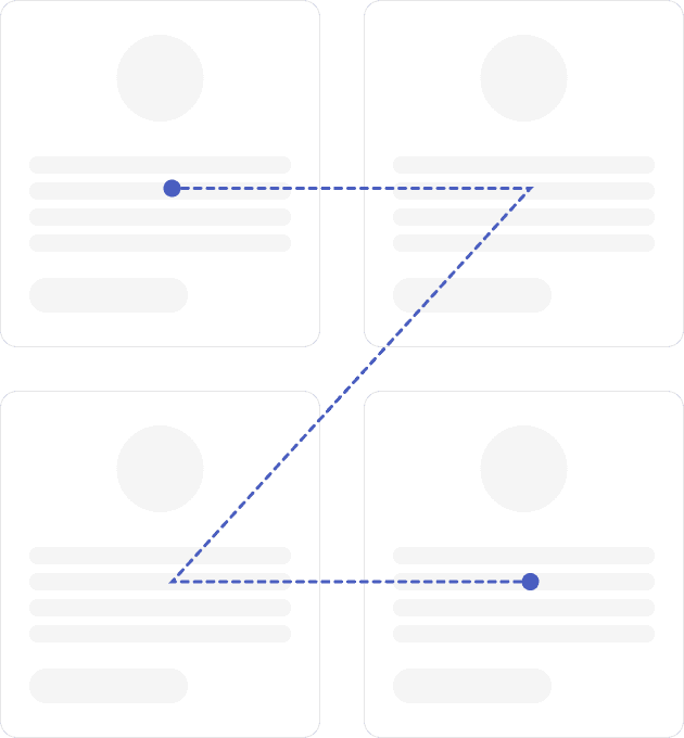
The hierarchy in a user interface must be clear and understandable. Gestalt principles about closeness, common area, similarity, closure, symmetry and continuity provide a good starting point for creating a visually tidy interface. In addition to this, it must be possible to navigate in a logical way with alternative input methods. It is therefore important to pay attention to semantic HTML, which means that the elements in the code are also structured in a logical way, so that, for example, screen readers pick up the elements in the intended order.
Colors, typography and contrast
Correct use of color and contrast helps to make a product understandable and, among other things, helps the user to identify important interactive elements and feedback. WCAG defines three conformity levels: A, AA and AAA.
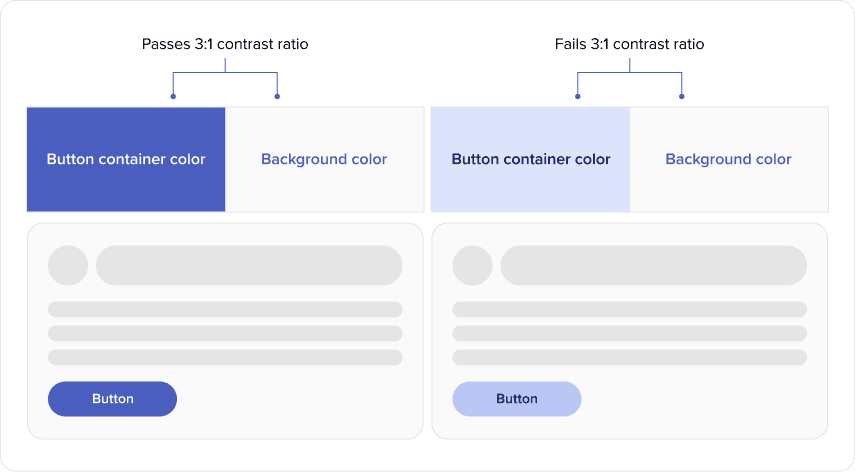
In the case of interactive elements, the color should have a contrast to the background of at least 3:1.
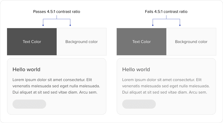
For WCAG AA, normal text must have a contrast ratio of at least 4.5:1 against its background. Large text—at least 18 point, or 14 point when bold—must have a contrast ratio of at least 3:1.
Click surfaces and sizes
WCAG 2.2's enhanced target-size criterion (AAA) requires pointer targets to be at least 44 by 44 CSS pixels, with these exceptions:
- An equivalent control on the same page is at least 44 by 44 CSS pixels
- The link is in running text
- The size of the click surface is determined by the user
- A specific presentation of the click surface is essential for the information to be communicated.
At level AA, WCAG 2.2 requires targets to be at least 24 by 24 CSS pixels or spaced so that a 24-pixel-diameter circle centered on each target does not intersect another target or its circle. The AA criterion has related exceptions for spacing, equivalent controls, inline targets, user-agent-controlled sizing, and essential presentation.

WCAG is not always clear
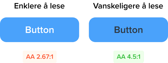
As a designer, it is important to be aware of the content of WCAG, but it is not something that should necessarily be followed dogmatically. There are several examples where WCAG falls short. If we look at the buttons below, the majority will say that the one with white text is easier to read, even if the contrast suggests the opposite. The reason for this is that WCAG's calculation of contrast only takes brightness contrast into account and not color contrast.
Society adapts
In Norway, we have a set of regulations that includes universal design. EU web directive was adopted in 2021, and constantly makes new demands. By 1 February 2023, it is required, among other things, that all businesses in the public sector must have an accessibility statement on their website. Furthermore, Norway is in the process of incorporating the EU's accessibility directive (EAA) into national regulations.
In general, accessibility in digital products is essential for all users to be able to interact with the products in a meaningful way, and should always be a priority for designers.
Is there something you are wondering about or want to discuss? Get in touch with us!
Build the future of your product with zero headaches
From MVP prototypes to scalable platforms, our full-stack dev team turns your roadmap into rock-solid code. Get to market faster without sacrificing quality.
Get started


